Cancer research uk
Case study
The Brand Tracking asks a random sample of people about their charity perceptions and consideration to take part/donate via an online survey.
The creative outperformed benchmark on almost all of our metric, some key highlights are:
24% increase in 'likelihood to sign up to RFL' vs. benchmark (58% vs. 34%)
11% increase in 'the advert caught my attention' (68% vs. 57%)
21% increase in 'RFL discount makes me more likely to sign up for RFL' (59% vs. 38%)
25% increase in 'likelihood to visit the RFL website' (68% vs. 43%)
22% increase in 'more likely to consider supporting RFL as a result of seeing the campaign (70% vs. 48%)
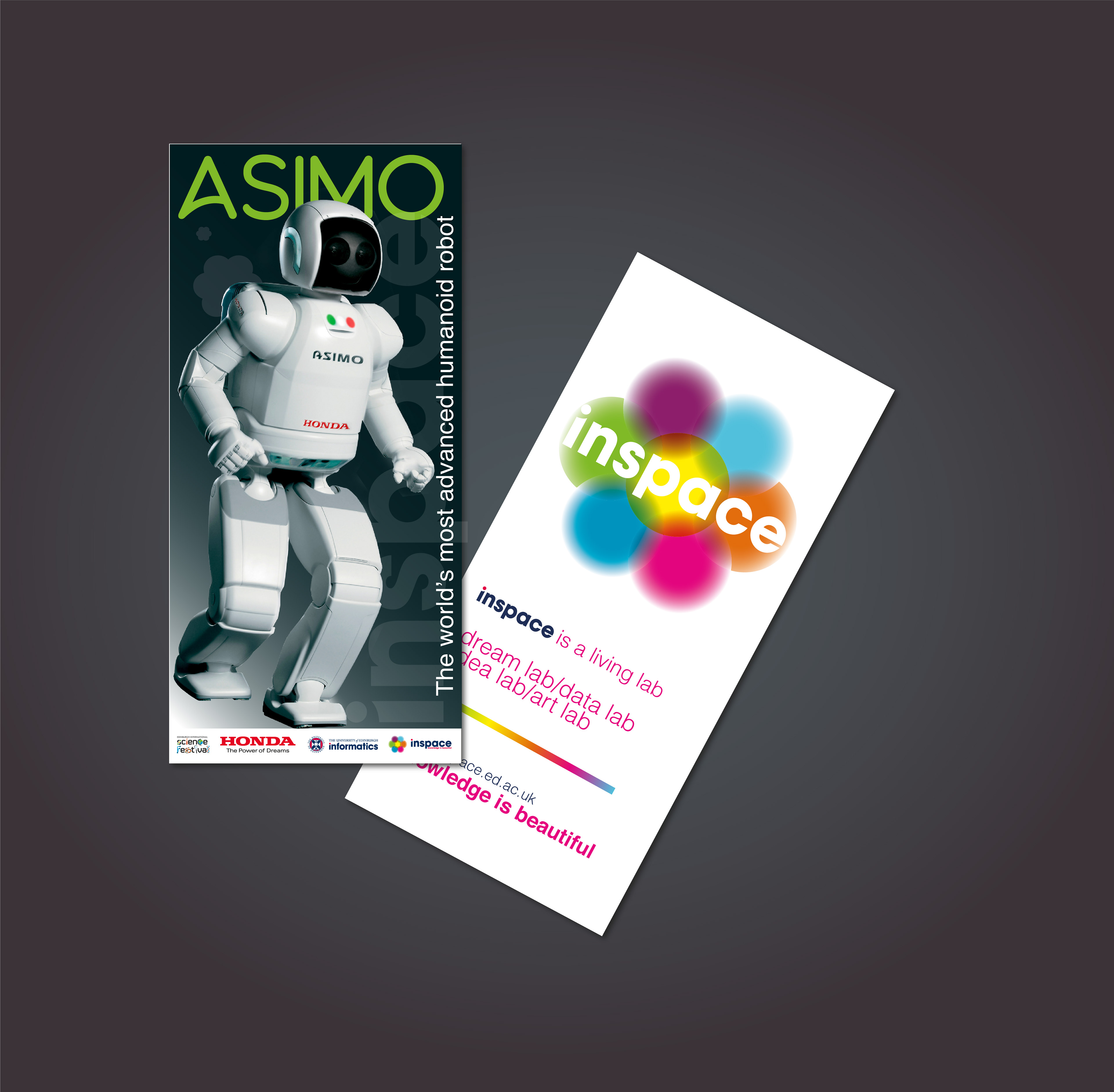
Promotional material Asimo, world’s most advanced robot as part of the Edinburgh Science Festival
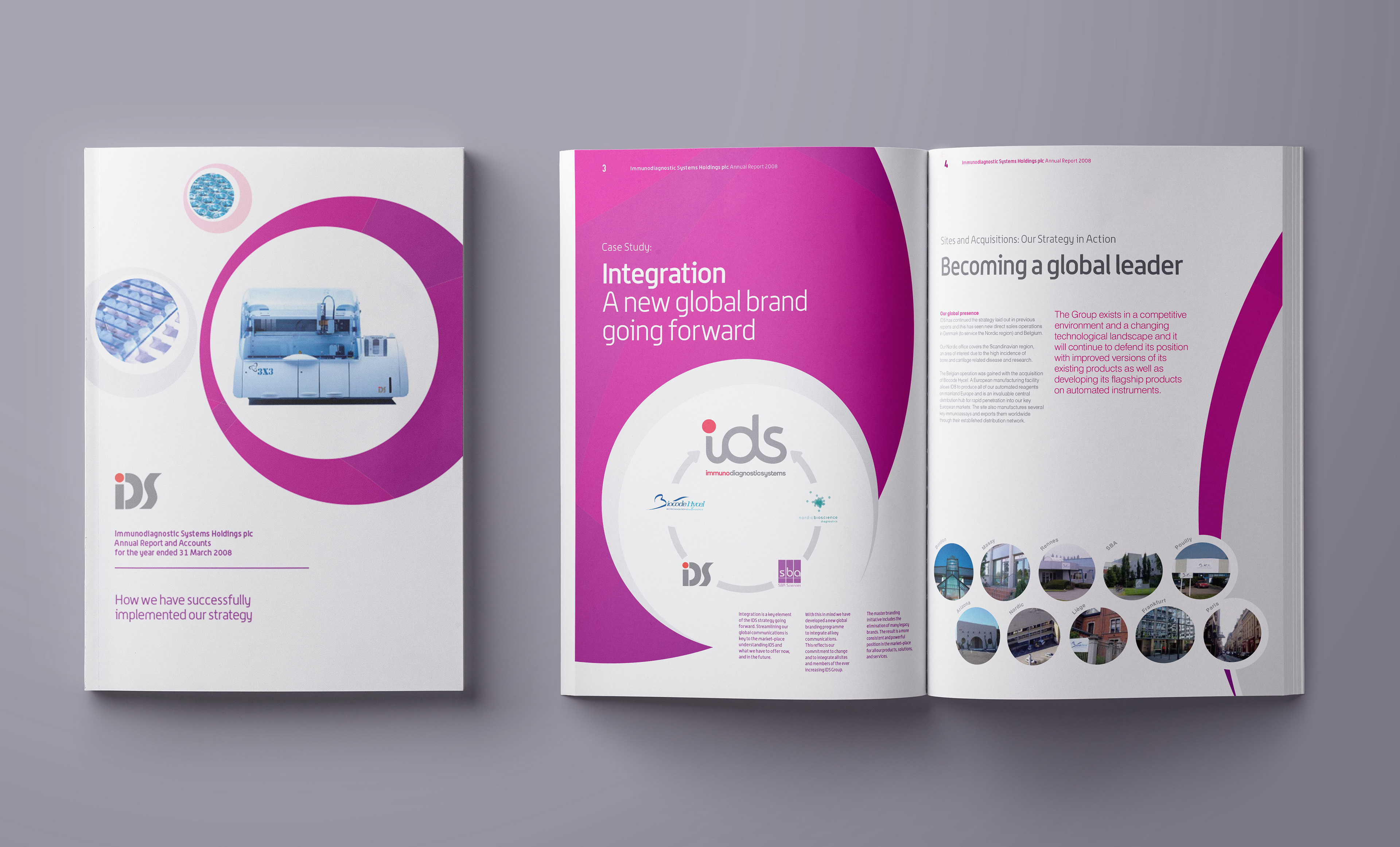
Creative Artwork for IDS Annual Report at Emperor Agency, Edinburgh
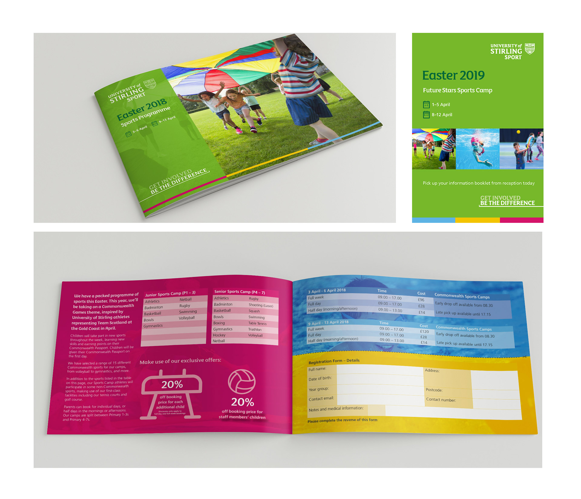
Univeristy of Stirling Easter Sports Brochure
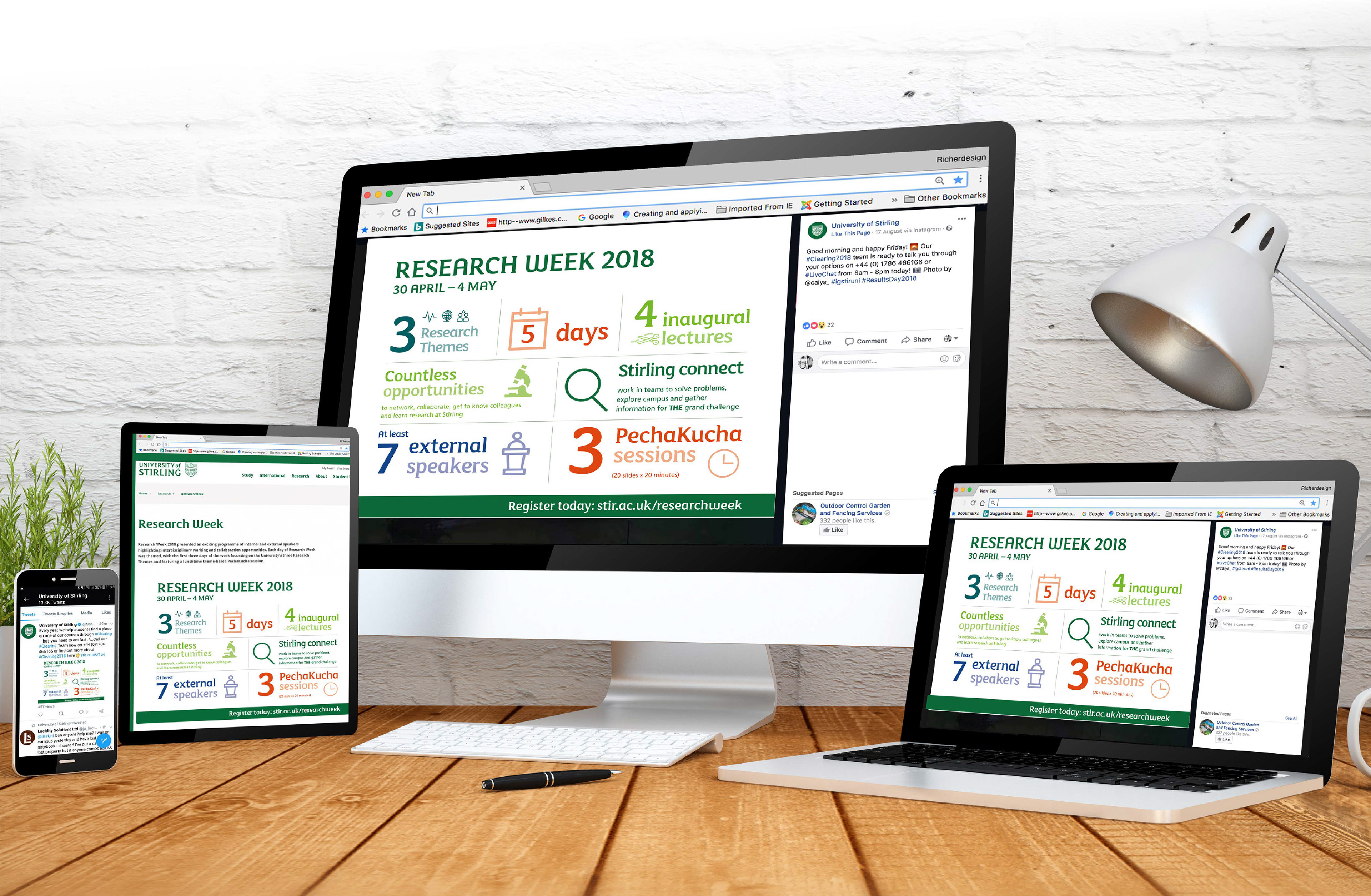
University of Stirling Infographics for Digital
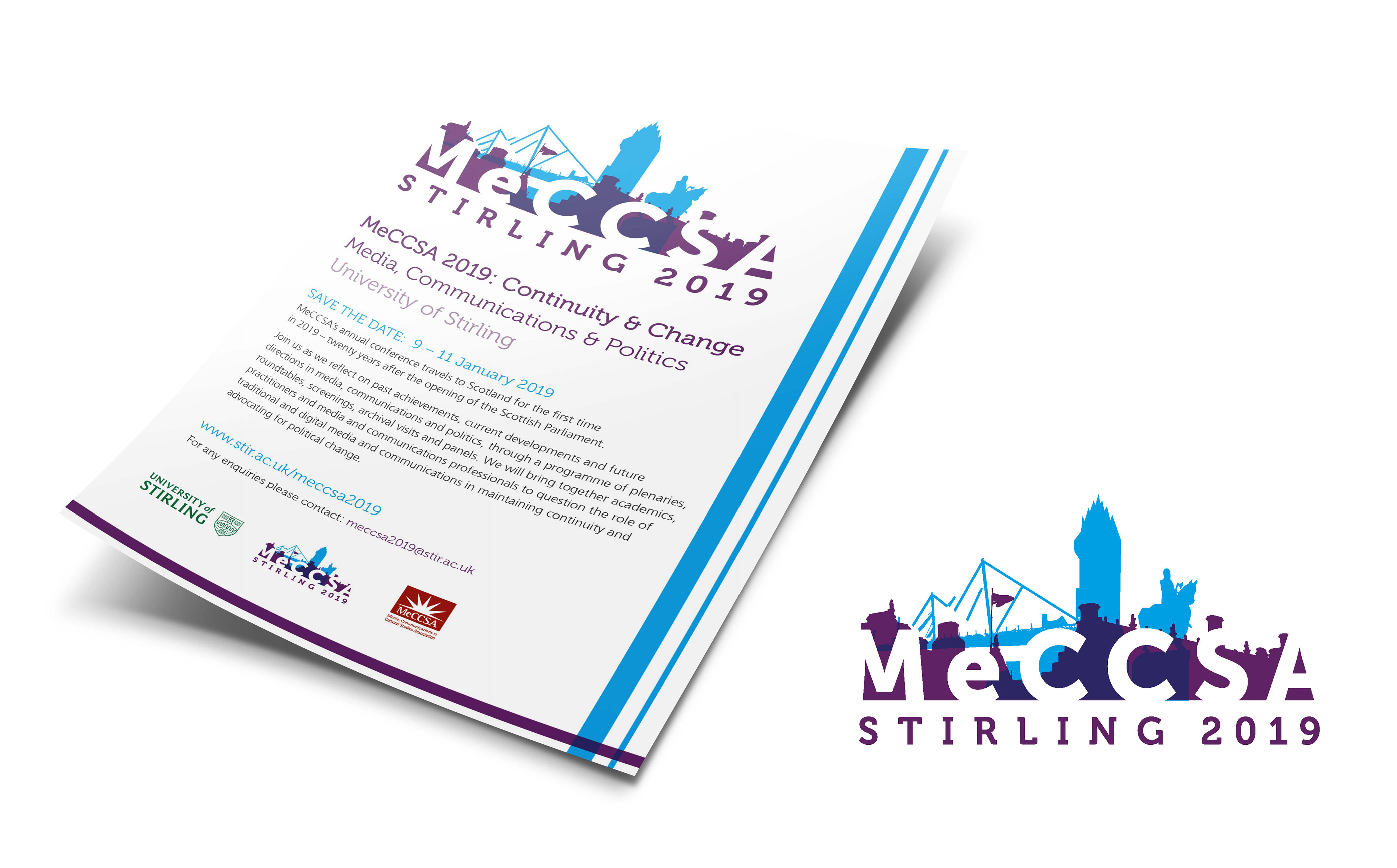
MeCCSA Conference branding and leaflet

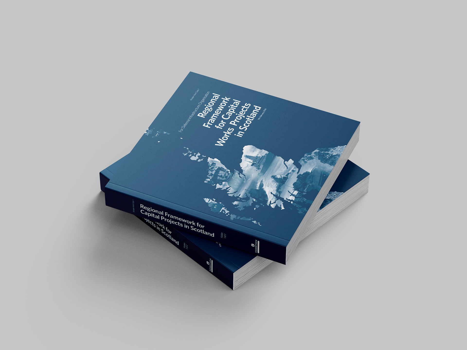
Bid proposal for Robertson Construciton
cASE study
Brief - A typographical, simplistic approach encapsulating the essence of leadership and management by use of solid colour, perhaps blues, and perhaps eye catching motif or lines to emphasize an innovative and creative side to the business, similar to used in LFHE. The logo would seem timeless. The inspiration would draw from existing competitors and LFHE materials.
Delivery
"For my new business I needed a strong, contemporary design that reflected my work style and Rich provided a memorable design with impact”
Ginnie Willis
Ginnie Willis
Development
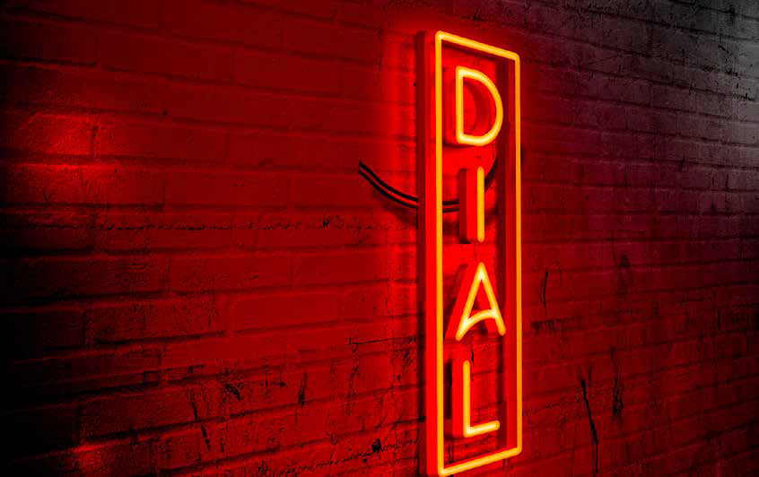
MA MOTION GRAPHICS - DIAL Branding
Providing a space for light and digital artists to create and display works all year round. I designed the identity and transformed it into a projected stencil for floor lighting and wayfinding and mock-ups produced. A proposed site was investigated as a suitable venue.
Providing a space for light and digital artists to create and display works all year round. I designed the identity and transformed it into a projected stencil for floor lighting and wayfinding and mock-ups produced. A proposed site was investigated as a suitable venue.
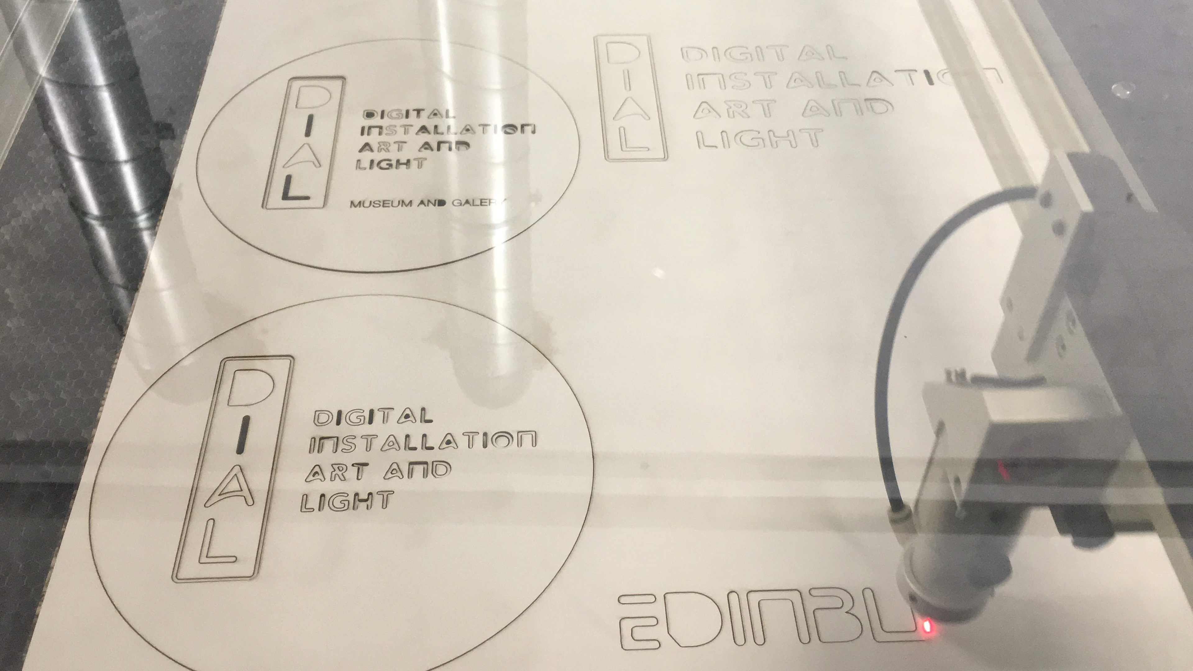
Laser Cutting
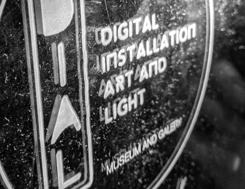
Perspex etching
